
While writing my book I had to prepare almost 200 drawings. I enjoy hand-drawing technical things very much, but thought I should take advantage of the necessity and learn some kind of computer drawing program. When I attended the Fat Quarterly retreat in London a couple of years ago, Lynne taught an introduction to Touchdraw morning workshop. Touchdraw is a very user-friendly, inexpensive, 2-D drawing program for iPad that you buy from the appstore. With the very small amount of information my exhausted and jet-lagged self retained from Lynne's class, I was able to trial and error my way through all of the book drawings. I also invested in an iPad stylus, which is much more accurate than fingers and a huge help. Yay!

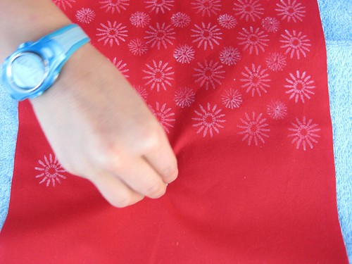
So, back to the logo. I knew I wanted a stylized poppy print of some kind, so I started with a radial design of elongated ovals. I figured I'd get something basic together, then ask my design guru Berene for help. It turns out I was able to draw something all by myself that I liked very much, so I went with it! The ombre is kind of quilty and overall, it is pretty similar to the print you'd get if you used a stamp pad and poppy seed pod to make a print.
My new cards arrived today and I'm very happy with them! They were ordered on vistaprint.com. The price, quality and ease of designing them right on their website made it a no-brainer for me. I love that you can put a photo on the back of your card and crop it however you like.
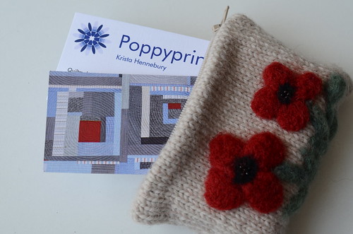
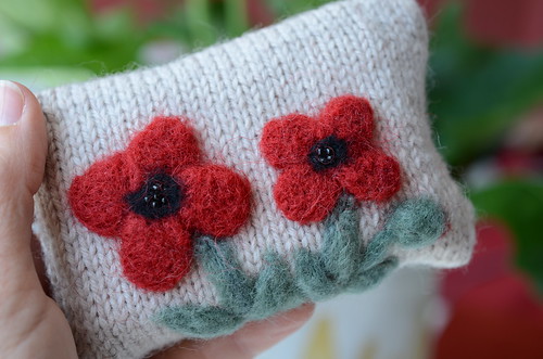
I'm going to carry them in this PERFECT needle-felted pouch gifted to me last year by a fellow Circus Mom after the hours and hours we spent sewing together for the show.
Ok! I think I'm ready for market. Well, just as soon as I figure out what to say at my schoolhouse. Yikes.