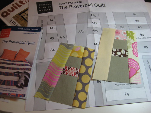
This is post #3 in the Proverbial Quiltalong. If you'd like to see what we're up to, have a
look here. Feel free to join anytime. This is a no-schedule, no voting, no judging quiltalong featuring random giveaway prizes just for participating! Here's the latest in the prize line up, direct from
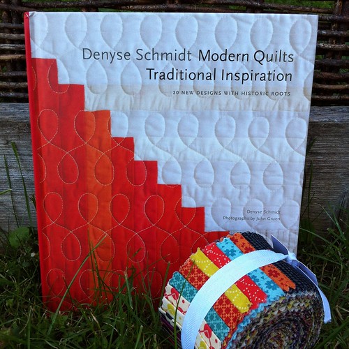
Denyse Schmidt Quilts!
A signed hardcover copy of Denyse's amazing new book and a jelly roll
of her sublime new collection Chicopee hitting stores now!!
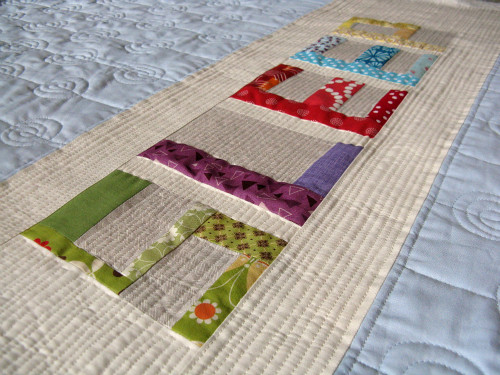
Most people have their patterns now, so before we get too far ahead of ourselves (helloooo, people who have already started piecing - you can skip this post!) I thought I'd share the process I went through when selecting fabric for my Blackbird Fly quilt.
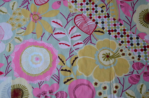
Everyone approaches colour and fabric selection from a different place or motivation. I don't have an arts background, nor am I a colour expert. I am often inspired by a single print, as I was for Blackbird Fly. Folk art-inspired prints are favourites of mine and when I saw this collection by Alexander Henry I was smitten!
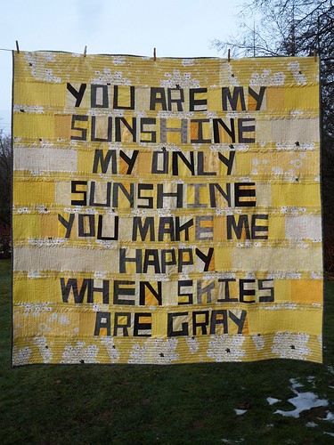
I knew right away that I would use the dotty print for a binding (the strip across the top right of the photo). Our bedroom is painted a gentle harvest gold colour, so the buttery and mustard yellows in the print were perfect. The background is not green, gray, slate or beige. I don't know what to call it, but I liked it! Using the colour dots on the selvage edge as a guide, I made colour groups of coordinating fabrics, making sure to have a range of hues and print sizes that would ultimately have a scrappy appeal.
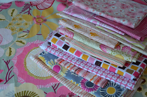
The pinks
At first I think B was taken aback when he saw the stacks of pink and he wondered out loud how it was that we were ending up with a pink quilt. I didn't really plan for that to happen; they are all just so pretty! When you look at the
finished project, I don't think it screams Pink Quilt. That is likely due to the fact that no single strip of fabric in the quilt is wider than about 2" and most are actually less than that. I also chose pink prints ranging from baby pink to bubble gum to fuschia and many that also included other colours.
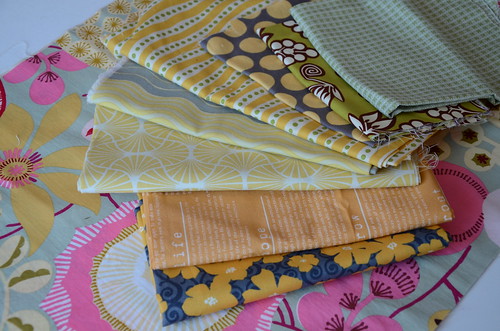
The yellows
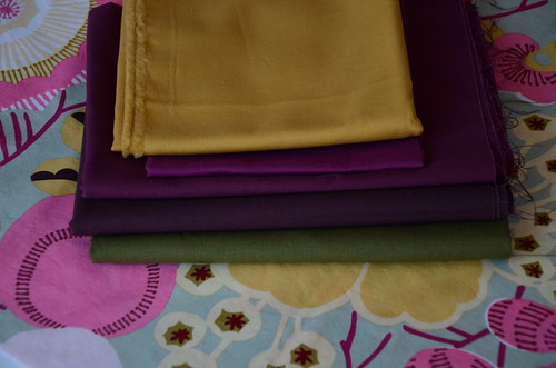
Some solids for a saturated ka-pow here and there
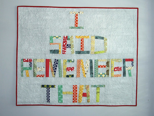
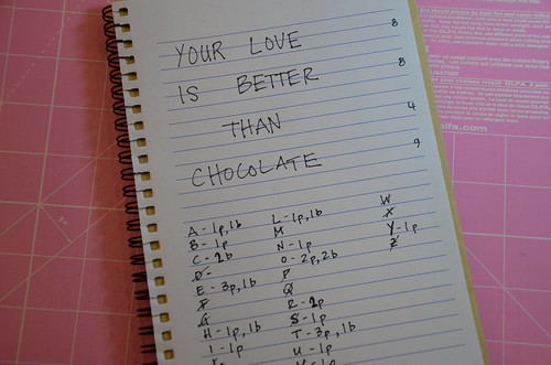
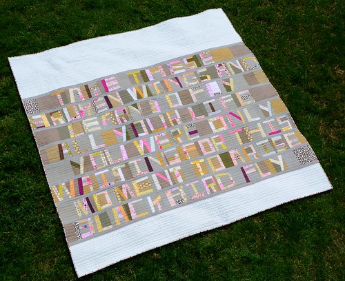
Then I had to work on the background. In Denyse's cover quilt, she defined her letters and background by colour. Her letters are orange and pink, her background is blue and grey. What look do you want? Do you want those letters and words to really stand out and make a statement? Then you need to go for contrast in colour or value. In my case, I was going for a more restful, blended look, without a stark contrast between the letters and the background.
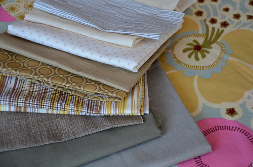
Keeping that in mind, I chose to focus on tans that were of a similar tone to the French General linen look 'solid' (bottom of the stack). I had several metres of the French General purchased on super sale and was really excited to finally use it. I love the look of prints and linen together, even if this is sort of faking it. There is some essex linen/cotton blend in putty (second from the bottom) thrown into some of the background as well. When looking through a ruby beholder, I can see that there is not a huge value difference between the fabrics of my letters and the background. Result: blended appearance.
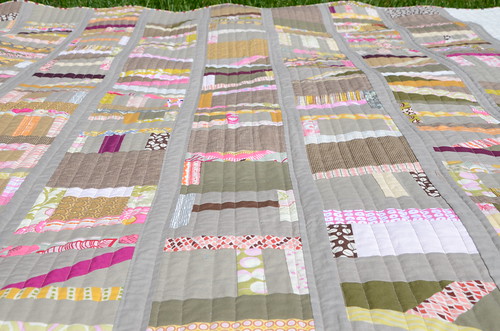
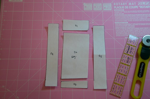
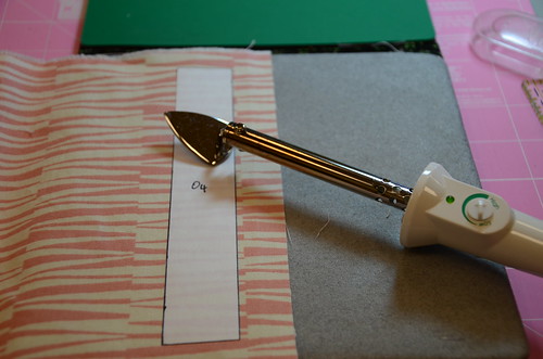
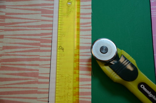
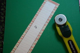
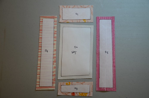
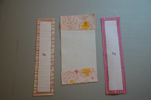
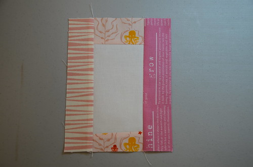
When all of my rows were pieced together and I had them out on the floor, I made the decision to sash them close together with the French General fabric, rather than separate them with a stark background as in the pattern sample. It made more sense to me that the words of the song were together, not apart. To fill out the queen size, I used Kona Bone along the top and bottom of the word section. That's what I love about this pattern, you can really take Denyse's fabulous templates and make the quilt your own not only with proverb/word choice, but with layout as well. I'll talk more about layout a bit later in the quiltalong once we've started working. Up next week in post #4: preparing your freezer paper templates and piecing your letters!
If you are participating in the quiltalong and have any questions about fabric selection, or would like to share your choices with the us, please add your photos to the
flickr group. It's so much fun to see what others plan to do.
Thanks Sponsors! (use buttons in the right sidebar to link directly!)