When I sent a picture of the 4-patch to my creative genius friend Berene looking for name suggestions (Quarter Round was her idea), she also thought I should try making it with an ombre effect. I held that thought.
Recently, RJR Fabrics asked if I'd like to participate in their What Shade Are You? feature on their Quilt With Love blog. The blog hop showcases their Supreme Cotton Solids. This was my chance to choose as many colours as I wanted to make any project my little heart desired. "Yes please" was my reply! Of course, actually choosing the fabrics took me f.o.r.e.v.e.r.
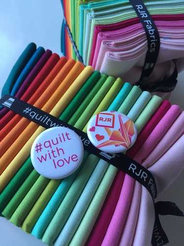
The last couple of years I've been enjoying working with the contrast of warm and cool colours in my improv work, so I thought I'd do the same with this quilt. Here are the colours I finally chose from the Supreme Cotton Solids colour card. They are listed in ombre order from lightest to darkest in their colour groups.
Shell Pink 175T
Candyland 86T
Hot Pink 217
Rhododendron 181T
Ruby Slippers 286
Glow in the Dark 204
Peridot 342
Wimbledon 205
Clover 128T
Kelly Green 127T
Goldenrod 92T
Carrot 131T
Tangerine Dream 276
Mandarine 159T
Chili Pepper 49T
Seafoam 301
Nile Green 90T
Toy Boat 366 C&S
Horizon 354
Twilight 353
and finally, Kerchief 364 C&S as a warm white background.
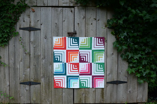
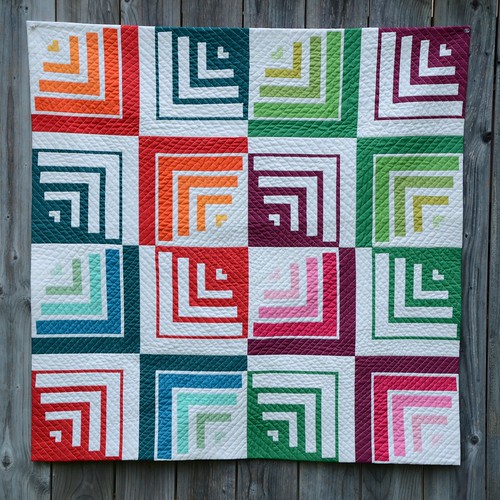
And here it is! All 38" square. Because I can't stop myself, there's a lot of straight line quilting 1/2" apart in concentric squares and it's all on the bias grain of the fabric. There was definitely some distortion of this little quilt (even with ditch-stitching the edges of the blocks to stabilize them first). A full wash and blocking was in order, so I did that prior to finishing the edge (see below). I can honestly report that these fabrics are 100% colourfast in cold water. No running, no fading. I used a mild, unscented powder detergent in a front loading machine and the colour catcher came out completely white.
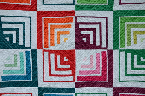
The quilting is all done with Aurifil thread #2026 in 40 wt (with white Aurifil 50 wt in the bobbin).
I love this positive/negative star that happens when the 4-patch blocks meet in the middle! Every one of the sixteen 10" blocks in this quilt are built with the same pieces. The resulting illusion of round edges within the square block are all about the colour placement and which strips are designated "background", or in this case white.
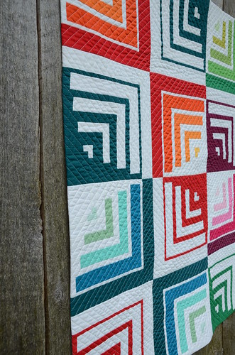
I just couldn't bear to border the blocks in with a binding, so I chose to face the quilt. I've done this before using different techniques and always been very pleased with the results. This time, I followed a tutorial by fellow VMQG member Terry Aske. You get such nice, sharp corners! (I used the method of cutting out a 1/2" triangle of batting in each corner of the quilt).
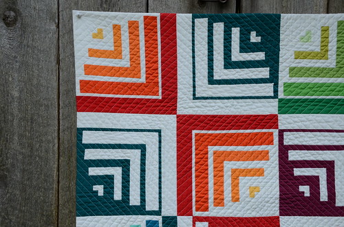
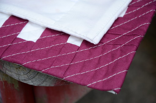
Here you can see both a front corner and what it looks like on the back where the facings overlap.
I'd like to thank RJR for the opportunity to work with their lovely solids. I'm excited about issuing a pattern for the Quarter Round block with some layout suggestions and colouring pages so that you can try it, too! I've got a couple of pattern testers raring to go, so hopefully I can finalize the pattern early in the fall.

33 comments:
This is fantastic! It would be fun to make with prints too but I so love it in solids.
WOW!! Visually stunning!! Way to go!!
P
I love all of the secondary and tertiary patterns that show up and the little hearts in each block - facing was a great choice
Turned out beautifully. Love the ombre effect.
This is so beautiful! I love the secondary pattern where the blocks meet.
This is truly beautiful. I love quilts with curves where there really aren't any!
I love how this turned out........such fabulous colours!!!!!
Very cool, Krista! You are so talented...
I've been using RJR solids for years, but I rarely see them in stores. your pattern is super cute!
Absolutely gorgeous it is definitely a showstopper! Thanks for sharing all your hidden secrets regarding the construction!
Gorgeous quilt! Congrats on the finish.
This is incredible. Will you be writing a pattern for it? ����
Really stunning, I love it!
Wow! This is stunning.
Wow! Such strong visual impact. Wondeful!
What a super quilt! So much to see! How fun to get to play with all those colors!!!
This is an awesome design and a beautiful quilt.
I love the design of this quilt and would like to have a pattern with coloring sheet. I, too, like the way you achieve the curved centers yet what I like most of all is the diagonal "hour glass" wave starting from the upper left. I can't wait to see what it would be in a larger version where the wave continues. I wonder if I'd see the same wave re-created when you had more blocks to make the quilt wider and longer.
Wow! What a striking design! Let me know if you need any more pattern testers.
Wow, wow, wow!!! This quilt is amazing! Wonderful colors!
Stunning! Beautiful job.
Love this Krista! Your work always takes my breath away, and this one is no exception. Can't stop looking at it.
This quilt is stunning! Can you tell me the reason you chose to use two different thread weights when quilting it?
It's so fabulous! I just love it!!
So amazing!!
Krista, I can't stop looking at this quilt. It is SO amazing! You've done it again with this beauty.
Such a dynamic quilt. I love it.
I love this Krista, What an engineer you are.
I love the mix of solid and white vs. ombre and I love the mix of warm and cool colours. Really beautiful
I'm behind in my blog reader so just seeing this version and I love it! Really a cool design!
It's stunning Krista! I keep seeing the little hearts too! I love the varying tones of each colour. I'm glad the washing went well! xoxo
The illusion is so cool in this design! Love it!!!
Love it! Can't wait for the pattern.
It's beautiful! I love that star that pops out in the centre! Can't wait to see it in person!
Post a Comment