
Photo by Sonjaartisania
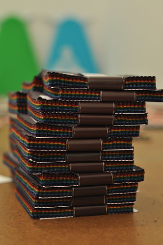
This dark charm pack was a challenge for me because it is not a palette I would typically work with. I asked my design-ie buddy Berene if she would like to combine her pack with mine and make a relief quilt that we could send to Japan. Many, many inspiration photos were then emailed back and forth. We discussed suitable symbols of hope and resurrection, as well as superstitions or colours to avoid. Initially we considered trying to incorporate a spiral into the design, but ultimately we decided that in the interest of time, we would keep things simple. We've only got 16 more days to get our quilt to Calgary in time for the massive shipment to Japan. Take a look at the Quilts for Japan website and be amazed at the generosity of quilters!! I'm so proud of my other guild - you'll see that as a group, the Lions Gate Quilters Guild along with our LQS donated NINETY-FIVE quilts!
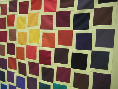
Using Malka's sewing machine cover from her book Fresh Sewing as inspiration, we bordered all 86 charm squares with 1 1/2" of Kona Celery on two adjacent sides. Six squares were left out of our final 8 x 10 layout, but there is at least one square of all 43 colours included - I promise! Berene and I shared the piecing work yesterday at my Mom's Crafting Day retreat. I got the 2 1/2" borders on today and I really like how the dark-coloured squares float off the background. There is an interesting optical illusion of the squares being set askew, but actually everything is squared and at right angles! I'm really happy with the west-coasty sunset vibe this layout has. Thank you Marsha for the use of your portable design wall!

The quilt will finish up about 48" x 60".
Now, to piece the back and decide on some quilting! Do you think we should bind it in the celery, or charcoal for a frame?
charcoal for sure! i love it. i love the motion is has. it is so beautiful krista! i love the color placement also.
ReplyDeleteI can't stop looking at it. BEAUTIFUL!
ReplyDeleteIt’s beautiful! A darker binding will be great, but not too dark...?
ReplyDeleteIt's amazing how much movement there is in this square design. Contrary to those who commented before me I think I actually would prefer a celery binding, for what it's worth :-)
ReplyDeleteGreat quilt for a great cause!
This is just divine - you could pick any colour for the frame but I really fancy the idea of the celery colour
ReplyDeleteI am on the charcoal side of the debate. It would be nice to see what each would look like though, up against the quilt top.
ReplyDeleteOh my gosh Krista, possibly one of my favourite quilts ever - this is just sooooooo beautiful. I cannot wait to see it quilted then I will add it to my best quilts ever gallery!
ReplyDeleteOh, oh, OH!!! Not a palette I work with either but its stunning!!! Very nice Krista!
ReplyDeleteI just love it - I would have a hard time giving this one up! And if it were me, I would go for a celery binding.
ReplyDeleteIt reminds me of a setting sun, just wonderful!
ReplyDeleteWhat a stunning quilt you've made! I love how you took a simple pattern and made it look amazing. I'd go for celery for the binding . . . to just let it blend right in.
ReplyDeleteNice job Krista and Berene. It's very generous of you and I am sure that the quilt will be well loved. I think I might go with the celery binding too.
ReplyDeleteAt the risk of sounding corny, it's just so...interesting! There's so much to look at in such a simple quilt. I keep scrolling up to look at it again. I really love it! Can't wait to see the finished quilt.
ReplyDeleteit really has the feeling of a cubist work of art! so cool Krista. I'd go with the charcoal binding. IMO, I think the celery binding would be too light and melt away while the charcoal binding would give your work a cohesive frame and make it look more finished... a thought.
ReplyDeleteThis is so lively. I think it will brighten up the spirits of the recipient. I like the way the squares float too!
ReplyDeleteOh wow, I love this look! It's very, very cool. I'd go with celery for binding. I think I like how the squares are floating, and the charcoal would tame them too much?
ReplyDeleteI love what you ahve done with them, very cool! Also thanks for the Japan link, I have a quilt ready to go but unsure where to send it, so will check the link out now.
ReplyDeleteit is gorgeous! Kudos to you and Berene for getting it whipped up and donated to the Japan relief. I'm torn between the charcoal and the celery to bind it - I think either would look fabulous.
ReplyDeleteKrista it is fabulous!! I love the look of the sun blending to the forest and the water - at least that is what I see.
ReplyDeleteI would like to see how the celery looks because I think it would keep the look of the blocks floating.
It looks fabulous! Celery binding for sure. You get so... much accomplished. You are my idol!
ReplyDeleteReally beautiful. I would definitely choose charcoal for binding.
ReplyDeleteAwesome quilt! I would go with a celery binding - I'm afraid that the darker might distract from the movement you have created.
ReplyDeletereminds me of a sunset over water ♥. I'm at a loss for a binding choice so I'll wait to see what you do!
ReplyDeletewhat a FANTASTIC quilt! i love what you did with the dark charm pack. a challenge to keep it light and you did it beautifully! i'm impressed!
ReplyDeleteWow, Krista, such a beautiful quilt. I love how you put all of the yellow/orange squares together. I like the idea of a darker frame for binding.
ReplyDeleteUm, I am speechless, this is absolutely gorgeous! I LOVE it! Who knew perfect squares could be so wonk-tastic! I think I'd do a darker binding, but whatever you do I am sure will look wonderful. Again, I love this, did I say that already? Oh. I love it.
ReplyDeleteOh man.... I just LOVE this quilt! I think the charcoal would frame it beautifully.... but really, nothing is gonna look bad on this one!
ReplyDeleteWow!!! I love it! It looks like a mosaic. Just gorgeous!!!!
ReplyDeleteCharcoal. This. Is. Fabulous. Can't wait to see it all finished.
ReplyDeleteSo simple but so stunning! It looks great!
ReplyDeletehow cool is that! Great job between the two of you.
ReplyDeleteThis is a stunning quilt! I love it. Edith from switzerland
ReplyDeleteThe celery is such a great choice for the background! It's been on my must-have list for months. My eye would prefer a dark binding.
ReplyDeleteYou certainly did the project justice. I love this layout. Have had my eye on it too!
ReplyDeleteTo frame or not frame? I never know what to do. It turned out lovely!
ReplyDelete